How to Choose Paint Colours for South-Facing Rooms This Summer

South-facing rooms are often some of the brightest spaces in the home, but that does not always make them the easiest to decorate. Strong natural light can change how paint colours appear, making some shades look warmer, brighter or more washed out than expected.

Why South-Facing Light Changes Paint Colours

South-facing rooms get a lot of warm natural light, especially from late morning into the afternoon. This can make paint colours behave differently once they are on the wall.

Warm shades, such as cream, yellow, peach, terracotta and red, can become much stronger in this kind of light. What looks soft on a colour card can feel a lot warmer and more intense in the room itself.

Very pale colours can also be tricky. In strong sunlight, they can sometimes lose depth and look flatter than expected, while brilliant white can feel harsh or glaring rather than fresh.

This is why cooler, softer shades often work well in south-facing rooms. Muted blues, gentle greens, soft greys and balanced neutrals can help offset the warmth of the light and make the space feel calmer.

The Shades That Balance Warm South-Facing Light

Trade Wind H441

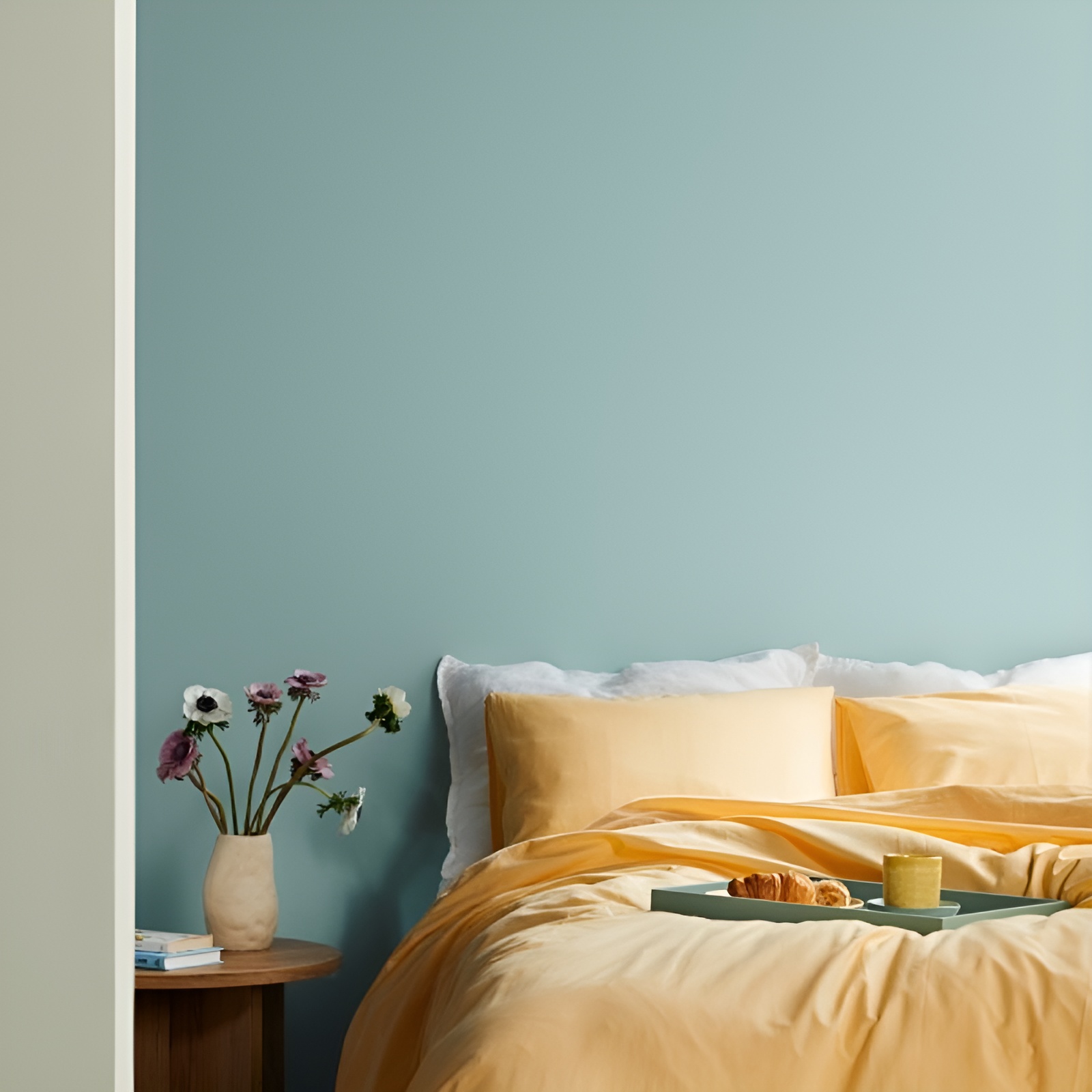
Trade Wind H441 is a soft blue that works well in south-facing rooms because it helps balance the warmth of strong natural light. Rather than making the room feel cooler in a cold way, it gives the space a fresher, calmer feel, especially in bedrooms, living rooms and other rooms that get a lot of afternoon sun.

Lotus F448

Lotus F448 is a gentle off-white that is a softer alternative to brilliant white. In very bright south-facing rooms, pure white can sometimes feel stark or glaring, whereas a shade like Lotus keeps the room feeling light while giving the walls a calmer, more comfortable finish.

Serpentine V447

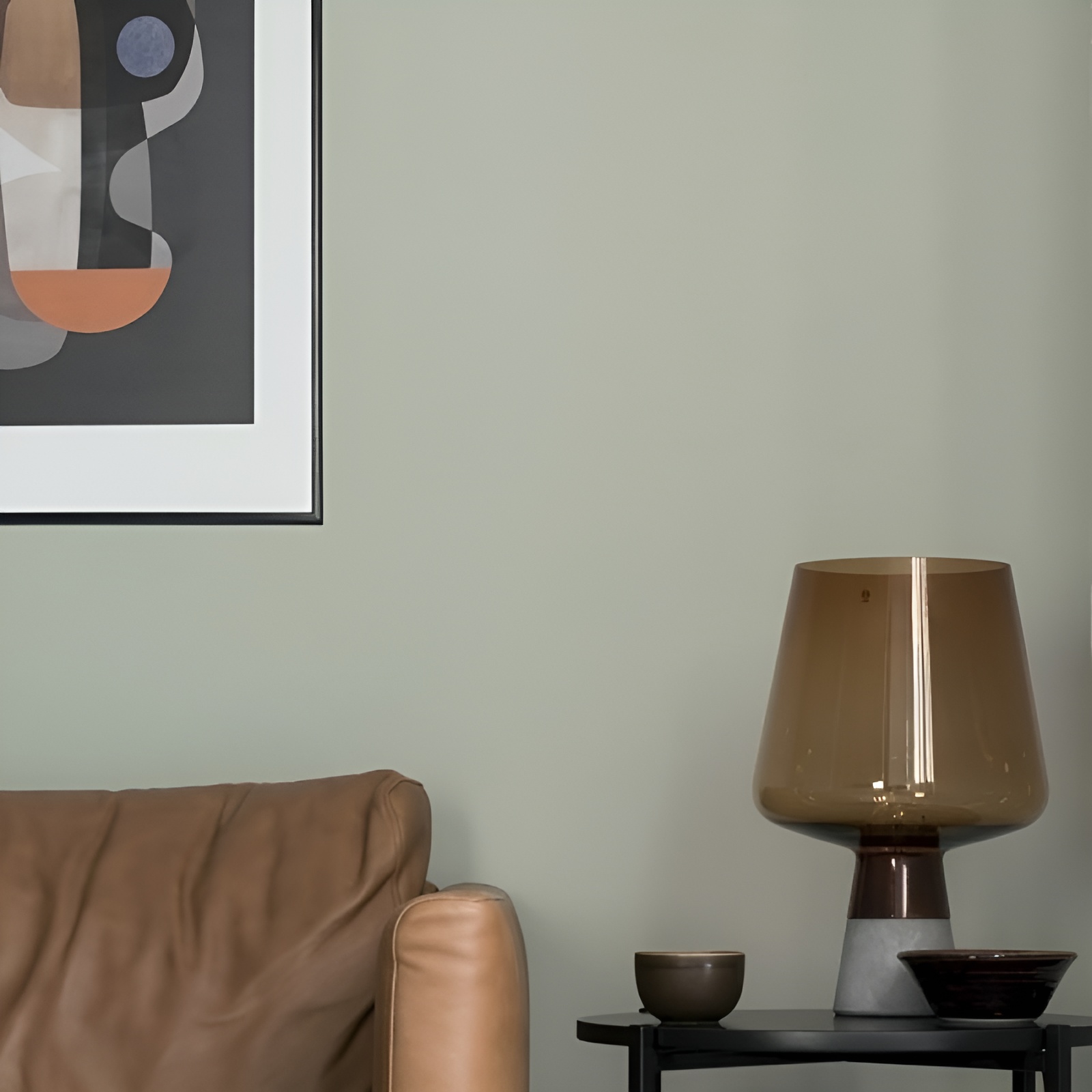
Serpentine V447 is a muted green that helps bring a more grounded feel to bright rooms. The natural green tone works well with strong daylight, helping to soften the overall look of the room without making it feel dull or heavy.


Colours to Be Careful With in South-Facing Rooms

While south-facing rooms can take a lot of colour, some shades can become stronger than expected in warm natural light. This does not mean they should be avoided completely, but they do need a bit more thought.

Warm colours such as yellow, orange, peach, terracotta and red can feel more intense in a south-facing room, especially during the brightest part of the day. If the room already feels warm, these shades can make the space feel even hotter or more saturated.

Brilliant white can also be difficult. Although it may seem like the obvious choice for a bright room, strong sunlight can make pure white feel harsh or glaring. A softer off-white is often a better option if you want the room to still feel light, but less stark.

Very pale colours should also be tested carefully, as they can sometimes lose depth in strong daylight and appear more washed out once applied to the walls.

Test Colours Before Committing

South-facing rooms change a lot throughout the day, so it is worth testing colours before painting the full room. A shade can look soft in the morning, much brighter in the afternoon and warmer again by the evening. Testing on more than one wall will give a better idea of how the colour behaves in the actual space, especially if the room has large windows, pale flooring or reflective surfaces.

Choosing paint colours for south-facing rooms is about working with the natural light, rather than against it. Softer blues, muted greens and gentle off-whites can help balance the warmth of the room, while still keeping the space bright, calm and comfortable through the summer months.

About Tikkurila UK

Rooted in Finnish craftsmanship, Tikkurila paints offer long-lasting, durable results enriched by Scandinavian innovation and stringent quality standards. Our brand is committed to delivering exceptional service, support, and quality to a diverse network of customers.

Stockist details