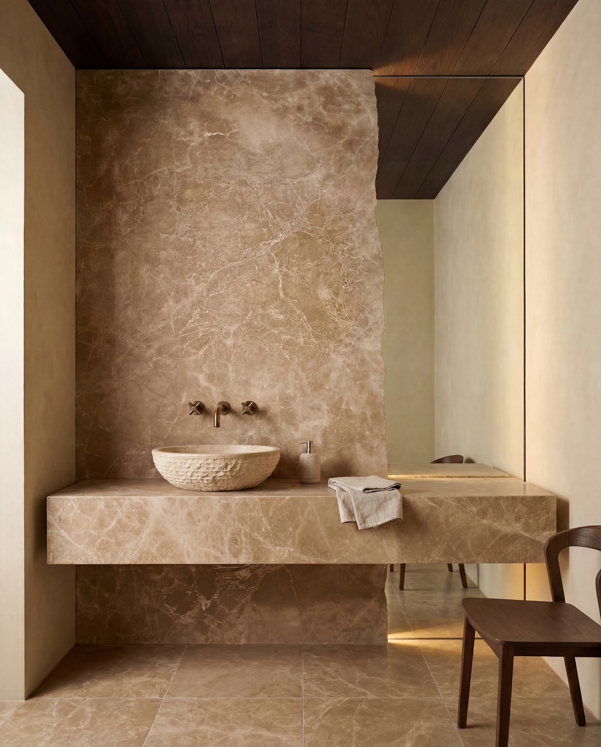
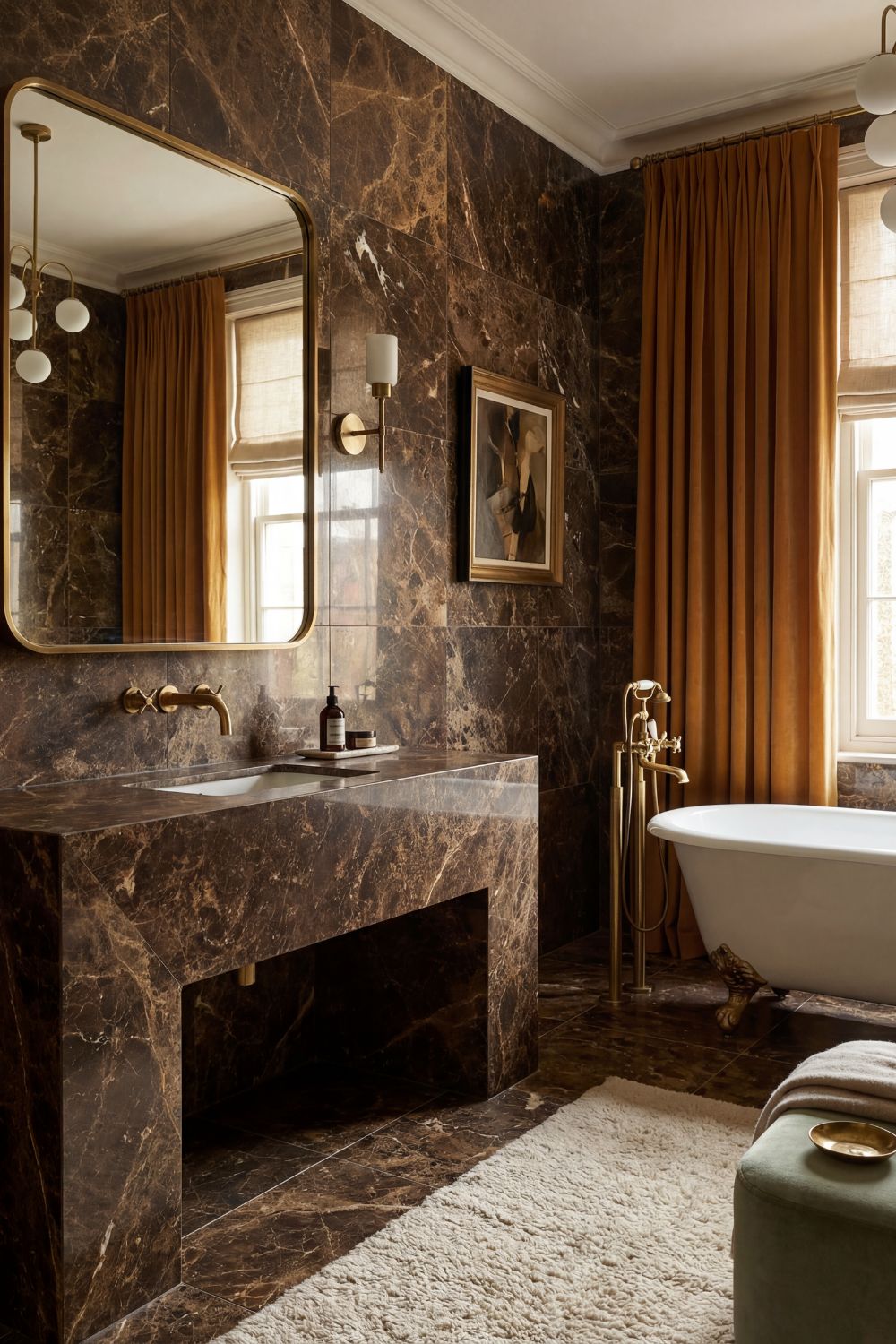
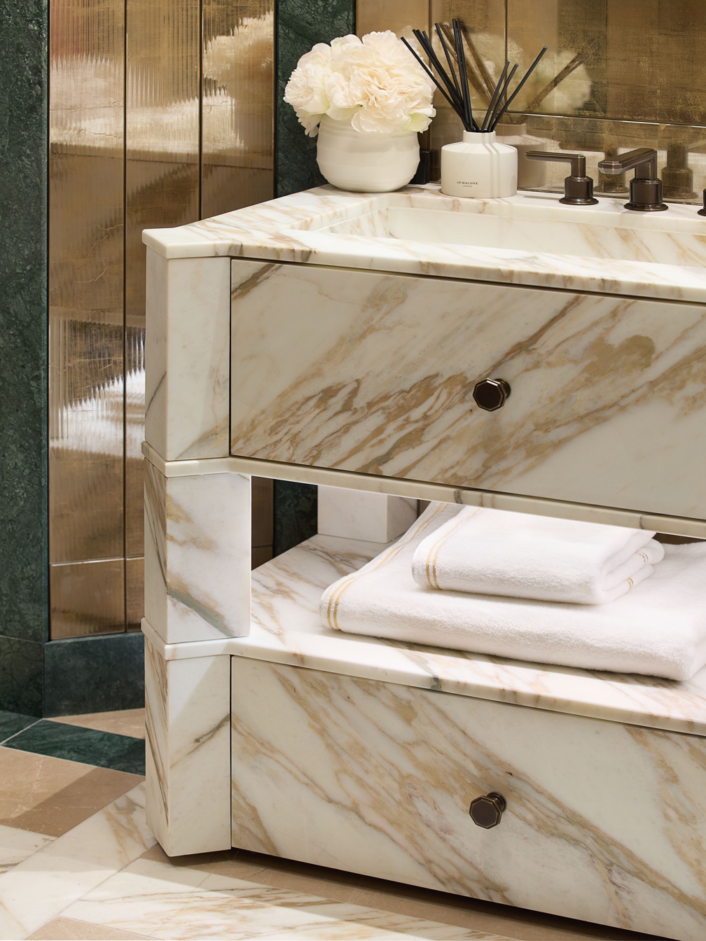
The stone itself is equally important. Natural stone cannot be treated like a printed surface, where every piece arrives looking the same. Veins shift direction. Pockets of colour appear unexpectedly. One section may feel soft and cloud-like, while another has a line so good it would be criminal to cut through it without a plan.
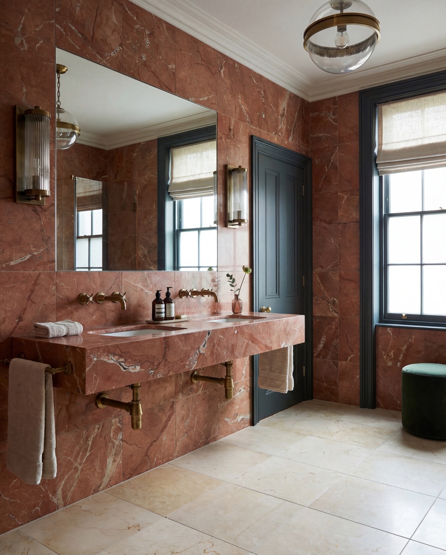
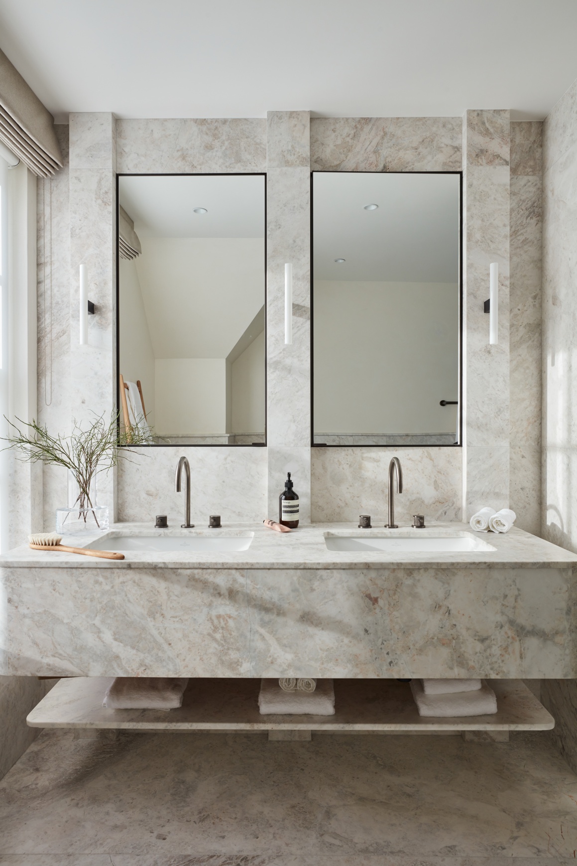
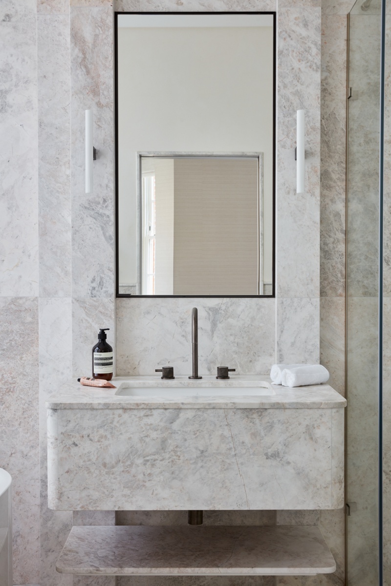
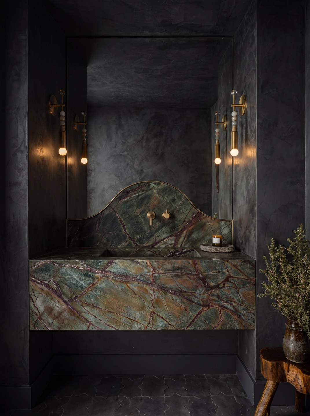
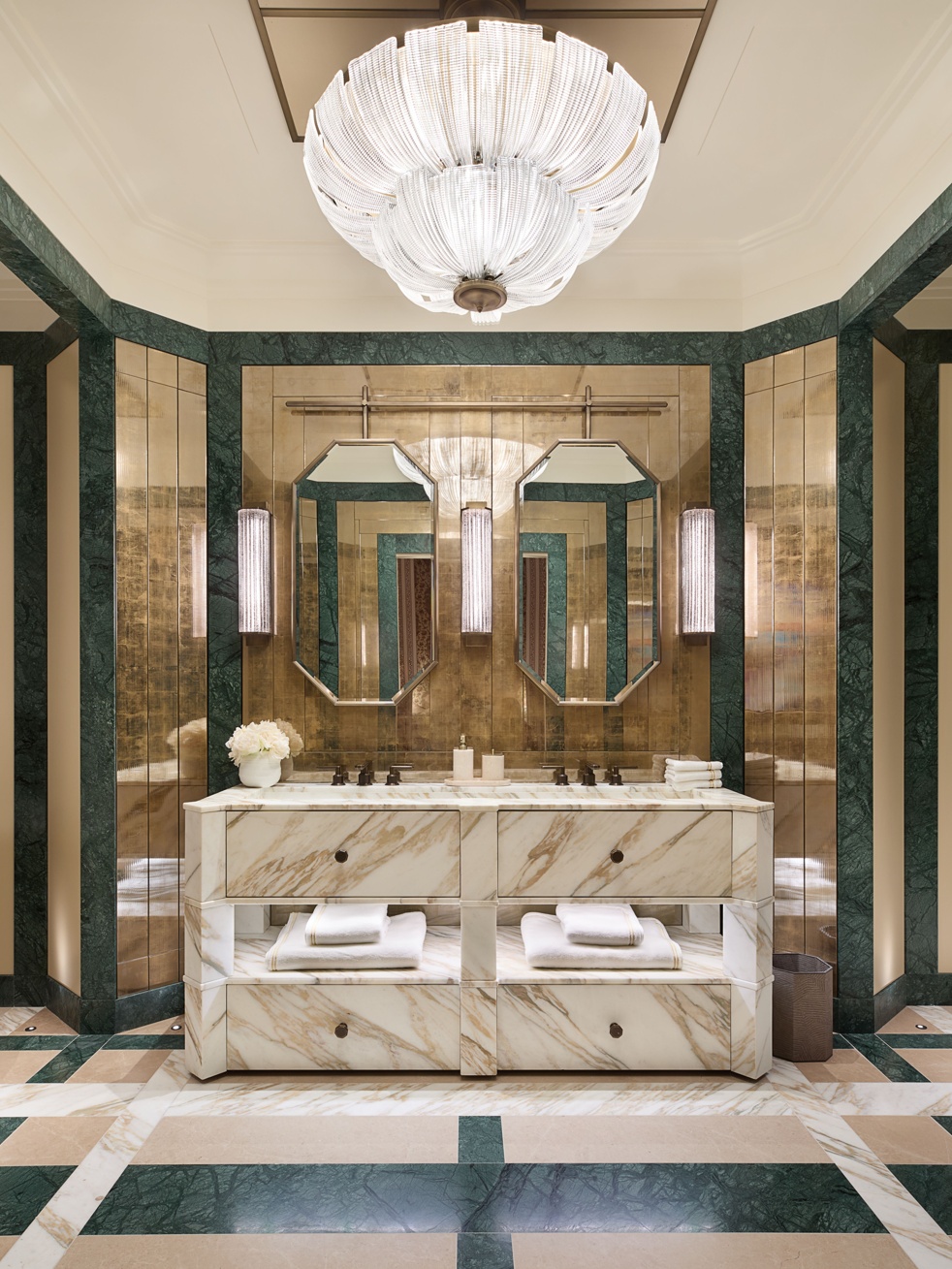
For that reason, slab selection is not merely about choosing a stone name. It is about looking at the individual piece and deciding where its strongest markings should sit. A bold vein might be carried across the basin front and onto the adjoining return. A quieter area could be reserved for the bowl, where the cuts and falls would otherwise interrupt the pattern. Where a splashback is included, the stone can be arranged so the movement continues upwards rather than starting again at random.
“You have to work with the slab you have in front of you, not the photograph that first made you want it,” Grazzie explains. “Sometimes the most beautiful part is not where you expected it to be, and that should influence the design. We might shift the bowl slightly, change the height of the splashback or use a particular section across the front so the stone gets its best close-up.
“I would never try to extract every colour from the stone and repeat it around the room. Pick one note and leave the others alone. An olive vein might lead you towards warm metal, while a tobacco marking could steer the wall colour. The basin has already done the peacocking, so choose one supporting idea and stop there.”

 Contact PR team
 Visit press office